Lead Generation Form Best Practices That Actually Convert
· 16 min read
Shorter forms don't automatically produce better pipeline. They often produce more completed submissions, but a two-field form can leave sales with no useful context, no routing signal, and no reason to prioritize one lead over another. The form isn't finished when someone clicks the button. It's finished when the right person receives a usable lead and acts on it.
The strongest lead generation form best practices balance two jobs: reduce unnecessary effort for the buyer and collect the information your team can use immediately. That means field count matters, but so do intent, validation, privacy copy, routing, response speed, and what happens on the confirmation screen.
Table of Contents
- Why Most Lead Form Advice Stops One Step Too Early
- Field Strategy That Matches Your Offer
- The Field Count Trap: Why Shorter Forms Lose Qualified Leads
- UX Mechanics That Lift Completion Rates
- Privacy, Trust, and Why They Are Conversion Features
- Testing Lead Forms Without Lying to Yourself
- A Practical Checklist and Quick Answers for Form Owners
Why Most Lead Form Advice Stops One Step Too Early
Keep it short" is good advice until teams turn it into a fixed rule. A short form can lift completion while lowering qualification quality if it removes the information sales needs to understand fit. The better question isn't "How few fields can we use?" It's "What's the minimum information this team needs to make the next interaction relevant?
A lead form is a qualification mechanism first and a friction meter second. For a content download, that may mean an email address and perhaps a name. For a product demonstration, role, company, use case, or buying timeline may determine whether the lead belongs with sales, customer success, or a nurture sequence.
Practical rule: Keep every field that changes what happens next. Remove every field that only makes the CRM look complete.
This is why the form belongs in the same conversation as the sales handoff. If a buyer is evaluating a product, an interactive digital sales room can provide useful product context before or after the form, but the capture experience still needs to tell your team what the visitor wants and who should respond.
The submission isn't the outcome
A completed form creates an obligation. Someone must receive it, interpret it, route it, and follow up with the right message. If a high-intent request lands in a shared inbox with no owner, the conversion happened technically but failed commercially.
That makes form optimization half UX and half operations. Marketing owns the exchange and the interaction design. Sales operations owns routing, enrichment, lead scoring, notifications, and service-level expectations. Neither team can optimize the full journey alone.
Qualification can justify friction
A longer form is defensible when the visitor has a strong reason to complete it and the answers directly improve the next conversation. A consultation request that asks about the problem to solve may help a specialist prepare. A newsletter signup that asks for company revenue, phone number, and job title is usually collecting curiosity rather than useful intent.
Use progressive profiling when the information is valuable but not necessary at the first touch. Capture the core contact detail first, then gather context through onboarding, follow-up questions, product usage, or a later scheduling step. The form should earn the right to ask more.
Field Strategy That Matches Your Offer
Start with the offer, not a form template. A downloadable checklist, a product demo, and a pricing consultation represent different levels of intent, so they shouldn't demand the same information.
For a low-friction content offer, ask for the information needed to deliver the asset and begin a sensible relationship. Email is usually the anchor. A first name can personalize delivery, while company or role may be useful when segmentation changes the nurture path. Don't ask for a phone number unless someone will use it.
A demo request deserves more context. Capture company, role, primary challenge, and perhaps the product area the visitor wants to explore. Job title often beats company size for B2B routing because it helps distinguish an evaluator, practitioner, executive sponsor, or procurement contact. Company size can support scoring, but role frequently tells the team who needs what kind of conversation.
Pricing and consultation requests sit at the high-intent end. A phone number can earn its place when the sales process depends on a live conversation and the team has a clear reason to call. If representatives only send an email, forcing a phone field adds suspicion without improving the handoff.
| Offer Type | Must-Have Fields | Optional / Conditional Fields | Routing Action |
|---|---|---|---|
| Content download | Email, delivery preference if needed | Name, role, company | Send the asset and place the contact in a relevant nurture path |
| Product demo | Name, work email, company, role, primary use case | Phone, timeline, current solution | Route by role, use case, and ownership |
| Pricing or consultation request | Name, work email, company, problem summary | Phone, budget range, timeline | Assign an owner and trigger a prompt human follow-up |
Optional fields can still provide signal without blocking completion. Let visitors volunteer a phone number, project timeline, or preferred contact method when those details improve the experience. A conditional question can appear only after someone selects a high-intent answer, which keeps the default path lighter.
A field belongs on the form only if it qualifies the lead or personalizes the next touch. If it does neither, it's decoration. Teams that want more information should explain which decision each field supports and who will use the answer. A clear field map prevents sales requests from turning into an unreviewed questionnaire. For pricing pages, a focused demo experience for a pricing page can also answer product questions before the visitor commits to a conversation.
The Field Count Trap: Why Shorter Forms Lose Qualified Leads
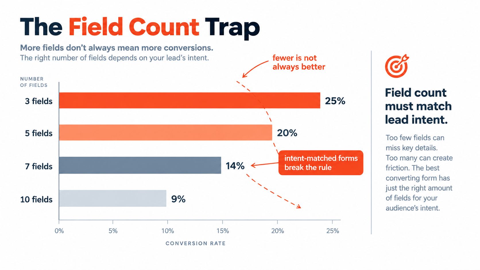
Shorter forms usually convert better, but “always use fewer fields” is lazy advice. A form should collect enough information to qualify the request and trigger the right follow-up. A four-field form can outperform a two-field form when the extra answers identify buying intent, route the lead, or help a representative respond with context.
A benchmark reported 23.1% median conversion for 3-field forms, 17.0% for 5-field forms, 11.4% for 7-field forms, and 6.9% for forms with 10 or more fields (Digital Applied's form conversion benchmark). Use that pattern as a starting rule: begin with the minimum qualifying fields, then add a question only when its answer changes routing, prioritization, or the next conversation.
Use thresholds as starting points, not laws
For top-of-funnel content, begin with one to three fields. Mid-intent offers such as demos can justify four to six fields when every answer supports qualification. Use seven or more only when a salesperson is involved, the offer has enough perceived value, and the team will act on the added context.
A major lead-generation benchmark found an average conversion rate of 17% across the forms studied, with an average of 11 fields (MarketingCharts' lead-generation form benchmark). Treat that result as a warning, not a target. An average form can still ask too much of your audience.
The same benchmark set reported that reducing a form from 11 fields to 4 could increase conversions by up to 120% (StackMatix's form optimization analysis). That finding justifies auditing bloated forms. It does not justify deleting every qualification question and forcing sales to recover the missing context after submission.
Volume and quality pull in opposite directions
Conversion rate is completed submissions divided by form views or starts, multiplied by 100 (IvyForms' conversion-rate definition). The metric shows whether the interaction produces submissions. It says nothing about whether those leads fit the market or become opportunities.
Shorten a field when it creates effort without useful signal. Keep it when sales uses the answer to prioritize, personalize, or route the next action. Optimize for qualified pipeline, not an impressive submission count. The form is only half the experience. Its real performance depends on what the team does after the visitor submits.
UX Mechanics That Lift Completion Rates
A form can contain the right questions and still lose qualified prospects through poor execution. Layout, labels, error handling, mobile spacing, and browser assistance determine whether visitors finish or abandon the page. Treat these details as conversion work, not visual polish.
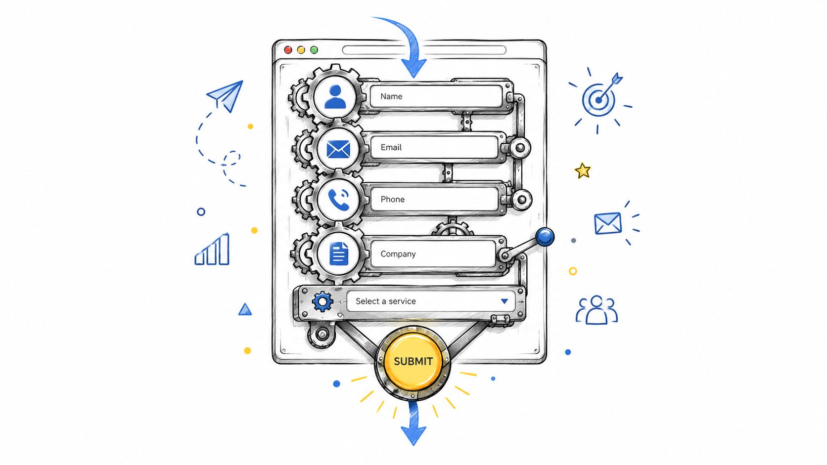
Use a single-column layout above a 768px viewport, with the form centered in a readable desktop width. A single vertical path reduces scanning and keeps the next action obvious. On mobile, separate fields clearly and provide tap targets that are comfortable to select.
Remove avoidable mental work
Place labels above inputs. Placeholder text disappears on focus and leaves people without persistent context, which also creates accessibility problems. Keep field heights between 44 and 48px, make tap targets clear, and set input types that open the appropriate mobile keyboard.
Use input masks for phone numbers, dates, and currency when they reduce formatting guesswork. Configure them to accept reasonable variations rather than rejecting valid entries. Browser autocomplete attributes such as name, email, tel, and organization let autofill and password managers handle information visitors have already entered elsewhere.
Run validation on blur instead of interrupting every keystroke. Each error should identify the affected field, explain the problem, and show the fix. “Enter a valid work email, such as name@company.com” gives direction. “Invalid input” does not.
Form UX also affects the rest of the conversion path. Big Moves Marketing's revenue strategies provides broader context for connecting page decisions with follow-up actions.
Break complex requests into manageable steps
Use a multi-step form when qualification requires several questions. Show progress, keep each step focused, and ask one meaningful question at a time. Splitting a form into two to three steps improved completion by 14% on average and by 21% for lead-generation forms in a benchmark. The point is not to make every form longer. It is to make a deeper request feel manageable when the answers improve routing or sales readiness.
Do not disable the submit button without explaining the requirement. Show missing information beside the relevant input, change the button state while processing, and block duplicate submissions. The form ends only when the visitor receives a clear confirmation and the right internal workflow begins.
Privacy, Trust, and Why They Are Conversion Features
Privacy copy belongs beside the action, not buried in a footer. A visitor deciding whether to submit wants a direct answer to three questions: what will happen to the data, who will contact them, and how often will communication arrive?
Place a short statement directly below the submit button. Link to the complete Rendemo privacy policy, but don't make the visitor hunt for the relevant promise. For B2B requests, name the company or team responsible for follow-up when possible. A known owner feels more accountable than a generic inbox.
Make trust specific to the moment
Trust signals work when they answer a nearby concern. A customer logo can support a B2B demo request, but it may clutter a simple newsletter form. A security badge belongs near payment-adjacent fields, not at the top of every form where it becomes decorative noise.
Consent needs the same discipline. Marketing opt-ins should be unchecked, clearly worded, and separate from the action required to receive the requested asset. Give people an understandable choice about future communication instead of hiding permission inside dense legal copy.
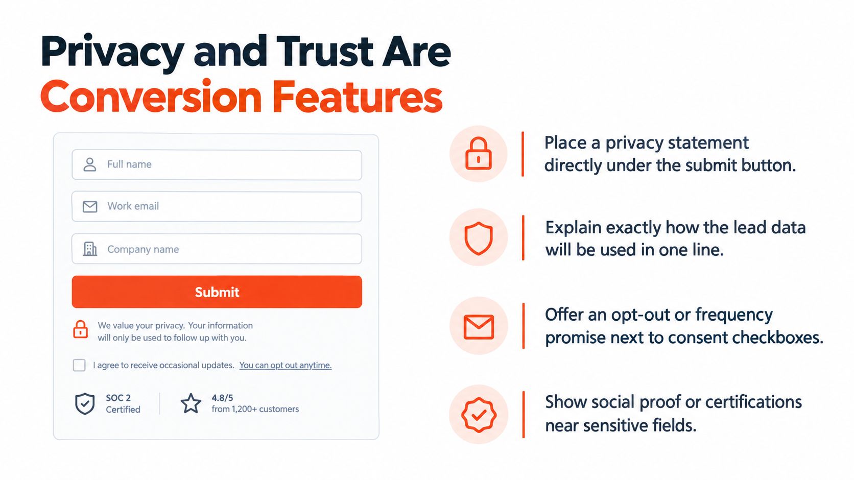
A strong privacy posture can increase confidence because it makes the value exchange visible. The wider principles behind landing pages that convert in 2026 are useful here too, especially the need to match page context, message, and action instead of treating the form as an isolated component.
Trust can't compensate for a bad promise
Don't add logos, badges, or compliance language to distract from an unclear offer. Tell visitors what they receive after submission, whether a person will contact them, and what they should do next. A precise promise usually carries more weight than a crowded strip of generic assurances.
The form should also behave consistently with that promise. If it says someone will respond, your routing system needs an owner. If it offers instant access, the confirmation page and delivery email need to work. Privacy is a conversion feature because trust is created by both the words beside the button and the process behind it.
Testing Lead Forms Without Lying to Yourself
A cleaner form is not automatically a better form. Test the business decision behind each change, especially when adding fields could improve qualification or routing. Start with one clear hypothesis and change one meaningful variable, such as field count, CTA wording, validation behavior, or layout. Change several at once and you lose the reason for the result.
Set two success measures before launch: a primary conversion metric and a quality metric. Form completion shows whether visitors finished. Lead-to-MQL and MQL-to-opportunity show whether the change improved pipeline. For ecommerce, revenue per visitor gives a stronger commercial signal than submission volume alone.
Give the test enough time
Run the experiment for at least one to two full business cycles, aiming for 100 or more conversions per variant and 95% confidence, following Brixon Group's B2B lead-form testing guidance. Ending a test during an unusual traffic period can turn a temporary fluctuation into a permanent form decision.
Write down the hypothesis, audience, traffic sources, variant details, start and stop conditions, and downstream outcome. Share failed tests as openly as successful ones. Otherwise, the team forgets which ideas underperformed and repeats them in a cleaner-looking redesign.
Read the fields, not only the total
A single conversion rate hides the friction. Review abandonment by field and device. When drop-off clusters around one question, check its wording, required status, format, and privacy cost before rebuilding the whole form.
| Metric | What It Tells You | Limitation |
|---|---|---|
| Form completion rate | Whether visitors finish the interaction | Doesn't measure lead quality |
| Field-level abandonment | Where friction concentrates | Needs enough traffic for a stable pattern |
| Lead-to-MQL rate | Whether captured leads meet qualification criteria | Depends on consistent scoring |
| MQL-to-opportunity rate | Whether qualification predicts sales progress | Can take time to mature |
| Revenue per visitor | Whether the form contributes commercial value | Requires reliable attribution and revenue data |
A benchmark cited by Brixon Group reports median form conversion of 4.7% and top-quartile performance of 11.2% or higher. Treat those figures as context, not a universal target. The right winner improves the outcome your business needs, whether that means more completed requests, better-qualified leads, or stronger revenue per visitor. Field depth and testing duration must be judged together.
A Practical Checklist and Quick Answers for Form Owners
A useful audit should be fast enough to run on a live page before a campaign launches. Check the offer, the fields, the interaction, and the handoff. If one of those fails, the form isn't ready no matter how polished the design looks.
Ten-minute deployment check
- Match fields to intent: Use one to three fields for simple content offers, more only when qualification affects routing or follow-up.
- Choose the right structure: Keep straightforward exchanges single-step; use multi-step layouts for complex requests.
- Place labels above inputs: Make every field understandable after focus and on assistive technology.
- Validate after blur: Show a useful correction near the input instead of waiting until submission.
- Write the privacy promise beside the button: Explain data use, follow-up ownership, and communication expectations.
- Check mobile behavior: Test keyboard selection, tap spacing, autofill, error states, and confirmation behavior.
- Confirm routing: Submit realistic examples and verify the correct owner, score, notification, and CRM record.
- Review the confirmation path: Deliver the promised asset or scheduling option immediately.
- Inspect field drop-off: Look for a single problematic question before cutting the whole form.
- Set a testing cadence: Review performance monthly and run controlled tests long enough to cover normal business cycles.
A practical deployment can use a form builder connected to a CRM, a scheduling tool, and analytics. For interactive product demonstrations, Rendemo supports published demos with optional lead capture and records a lead event when a viewer submits the form, which can fit a product-led qualification path when the demo itself supplies useful context.
Quick answers for common conflicts
When does shorter hurt qualification?
When removing a field forces sales to repeat the same discovery questions or eliminates the signal used for routing. Keep the field if the answer changes the next action.
Should the phone number be required?
Require it only when a live call is part of the promised experience and your team will use it. Otherwise, make it optional and explain the preferred contact method.
Will a multi-step form increase drop-off?
It can if the first step hides the value or the progress indicator is misleading. Used for complex requests, step-based layouts can reduce perceived effort. Measure completion and lead quality together.
What if sales demands more fields?
Ask sales to identify the decision each field supports, the owner who uses the answer, and the time at which it matters. Move nonessential questions to progressive profiling when they aren't needed for first contact.
How long should a test run?
Use at least one full business cycle, and preferably two, while targeting sufficient conversions per variant and the confidence standard described in the testing section. Stop only when the pre-registered rule is met, not when a dashboard shows a convenient early lead.
What should conversion rate mean?
Use completed submissions divided by form views or starts, multiplied by 100. Keep the denominator consistent across variants so the comparison remains meaningful.
Rendemo helps SaaS teams turn real product workflows into interactive demos with optional lead capture, guided steps, branching paths, and viewer-progress analytics. Visit Rendemo to create a product experience that answers questions before the form and gives sales more context after submission.
See it instead of reading about it
Record one workflow from your real product and publish a clickable demo anyone can follow. Real-HTML capture is on the free plan.
Start free